
Aqseptence Group – Rebranding of Bilfinger Water Technologies after carve-out
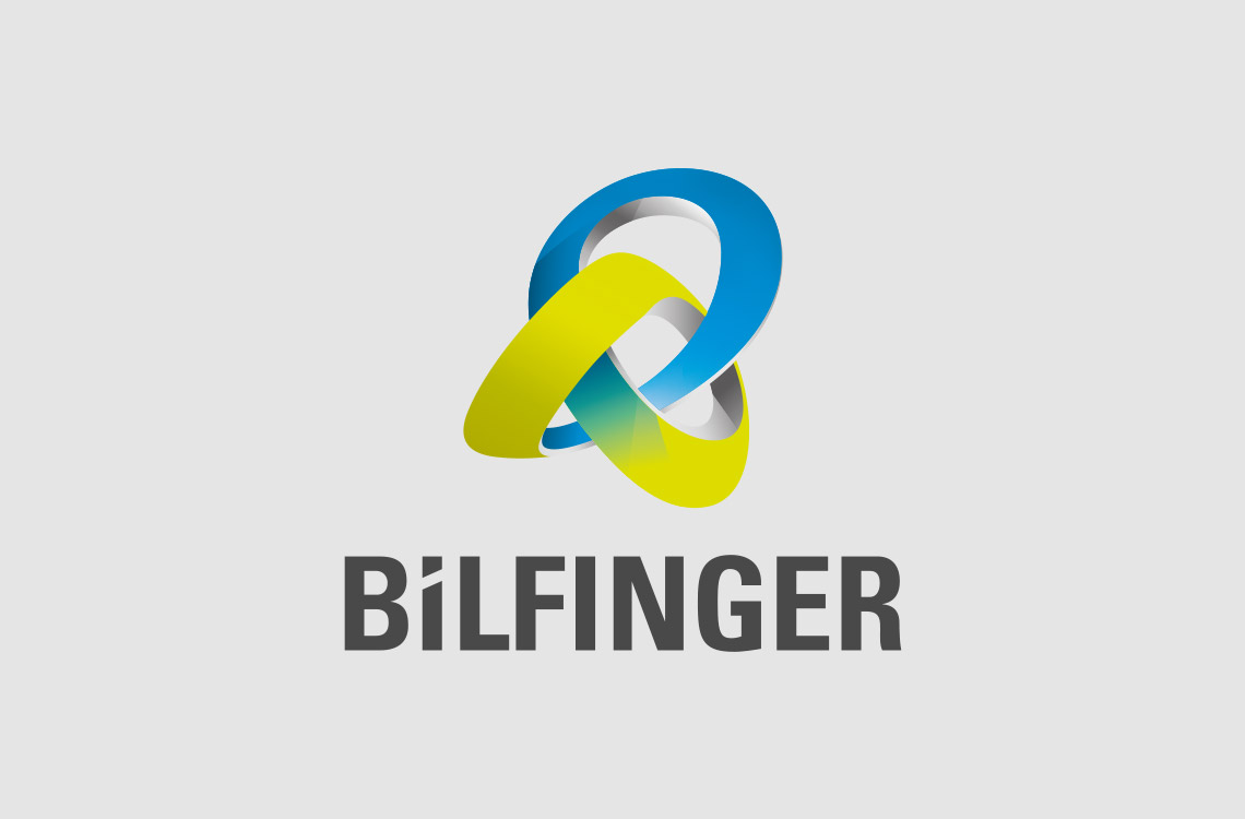
In spring 2016, the Bilfinger Group sells its Water Technologies unit to the Chinese environmental technology company Chengdu Techcent Environment. As part of this transaction, Truffle Bay develops a new brand positioning and the new name »Aqseptence« as a clear reference to its core competence in water and separation technology. This is also visualized by the new word/figurative mark, which shows a drop of water in front of a grid.
The highly distinctive color scheme in combination with the striking corporate typeface ensure a unique brand identity. The layout system symbolically picks up on the separating rods in the separation and filtration grids. With these means, the well-known product brands such as Passavant, Diemme, Roediger, Noggerath or Johnson Screens are also seamlessly integrated into the new brand appearance, thus transferring their brand energy to the new company name.
The company presented its new brand identity to the trade public for the first time at IFAT 2016, the world's leading trade fair for environmental technologies.
The eye-catching design of the Aqseptence Group was awarded the iF Design Award 2018 in the category »Communication: Corporate Design« and the German Design Award 2019 (Special Mention) in the category »Corporate Identity«.
CLIENT
Aqseptence Group GmbH, Aarbergen
www.aqseptence.com
INDUSTRY SECTOR
Technology
AWARDS

SERVICES
Insight: Brand analysis, Strategic analysis, Market analysis, Competitive analysis
Identity: Purpose & brand positioning, Naming, Claim, Communication strategy, Brand strategy, Brand architecture, Corporate & brand design, Story & key messages, Brand & design management
Experience: Internal branding, Print media, Digital design, Spatial design
NAME & POSITIONING
The core competence in a nutshell
The new company name combines the words »aqua« and »separation« and thus elegantly refers to the core competence of water and separation technology. The suffix also carries the connotation of »competence« – and thus refers to the high reputation that the team and the internationally known product brands have enjoyed with customers and business partners for many decades.
The catchy brand promise »Reliable Performance. Sustainable Results« underlines the self-confident appearance of the newly formed company and signals a very close customer and high performance orientation. It is – just like the brand values »Confident. Competent. Open-minded.« – aspiration and obligation at the same time.


DESIGN CONCEPT
Powerful and emblematic
The logo of the Aqseptence Group presents itself with clarity and character. Through the interplay of word and figurative mark as well as the concise and contrasting color scheme of »progressive green«, black and white, the brand creates a strong presence, a unique identity and a high degree of recognizability.
The figurative mark symbolizes a drop of water in front of a grid and thus – like the new company name – visualizes the core competence of the company: separating water and solids from each other. The basic idea of the grid as an essential element for separation and subdivision can also be found in the layout system of the brand appearance, where it can be used flexibly, but at the same time creating identity at all times across all media. The expressive ITC Lubalin Graph Std as a self-confident corporate typeface is also characteristic of the brand identity.


»Progressive green is a modern and future-oriented color that creates a strong, unique and self-confident character.«
The brand appearance of Aqseptence is characterised by the use of »progressive green« and its contrast to the achromatic colors black and white. The corporate colors are supplemented by four different gray shades, which are used as basic colors for backgrounds or graphics. The colour scheme is distinctive and ensures a high degree of differentiation in the market presence.
BRAND IMPLEMENTATION
Form follows content
The principle of separation derived from the logo is also used in the layout system. Diverse, defined format divisions offer a wide variance and can be used for various media of the brand experience.


You have questions about this project or want to work on advancing your brand?
We look forward to your inquiry and will be happy to advise you on the phone or arrange a personal meeting.
Truffle Bay is an owner-managed, integrated strategic brand consulting and design agency based in Munich. With clarity and creativity we help ambitious companies and entrepreneurs to discover, define, design and bring to life their unique identity – to create strong brands as the compass and catalyst of entrepreneurial change processes as well as attractive and differentiating brand experiences to win and retain customers and employees.
Truffle Bay is a member of bvik – Bundesverband Industrie Kommunikation e.V. Test
© 2023 Truffle Bay, All Rights Reserved.
Imprint | Privacy Policy
TRUFFLE BAY Brand Strategy & Design
Widenmayerstraße 36
80538 Munich
T +49 89 452 23 65 10
F +49 89 452 23 65 49
kontakt@trufflebay.de
Privacy